


© 1997-2006
Gareth Knight
All Rights reserved
|
|

Amiga
Imagery: The meaning behind the Amiga's changing
image
It has been over 20 years since a small American company
first associated the Amiga brand with a computer. Although the word
is an everyday part of the Spanish language and has reasonable
success as a brand in the music industry, it would become synomous
with 16-bit computing and high-quality graphics. In this article I
will be analyzing the various images that have been used to
symbolize the Amiga and examines how the designs represent the
state of the Amiga market and the internal politics of the owners
at the time.
Amiga - Dedicated to the Science of fun (1982
- 1984)
Boing Ball - the unofficial Amiga logo (1984
- 1985)
Checker Mark (1985 - 1994)
Stylized 'A' (1985 - 1987)
Amiga Case design (1975 -
1995)
Commodore Digital Convergence
(1991 - 1992)
Post-Commodore Logos (1996 -
Present)
Boing Ball - the official Amiga brand (1997 -
Present)
Amiga -
Dedicated to the Science of fun (1982 -
1984)
|
|

|
The first Amiga logo was created by the American company,
Hi-Torro during 1983. To avoid confusion with the lawnmower
manufacturer 'Toro' the joystick designers made a strategic
decision to change their name to Amiga Corporation. The Amiga name
was chosen through the teams desire to move away from the typical
company names of the past (such as International Business Machines)
to one that would be more attractive to technophobes and
non-computer users. This was smart thinking on their part, during
the 1980's IBM still had the monolithic image conjuring images of
room-sized computers and people in white coats. The Amiga brand
became extremely important during the late 1980s when Commodore
marketed the machine towards the home market.
Like its competitors Acorn and Apple, the Amiga name symbolized
that computers were tools designed for the ordinary Joe or Jane to
learn. The logo demonstrates the fashionable electric design of the
early 1980's - the AMIGA brand being composed of a continuous red
streak that symbolized a flow of electricity. At the time this
would convey a level of complexity through the stylized font. The
oxymoronic subtitle, 'dedicated to the science of fun' also
attempts to create a unique 'seriously fun' image creating brand
awareness for the company.
It may be presumptuous to suggest 'The Power System' heading is
an earlier indicator to the development of the Lorraine
prototype.
|
TOP
Boing Ball - the unofficial Amiga logo (1984 -
1995)
|
|
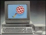
To demonstrate the Amigas hardware capabilities, the bouncing
Boing ball demo was written late one night at the Winter CES show
in January 1984. At the time it was an amazing achievement that
surpassed all current systems of the time, seamlessly handling real
physics whilst multitasking in the background.
The original Amiga team preferred the Boing ball design, adopting
as the unofficial trademark. Dozens of Boing Ball logos were made
for the A1000 launch, until Commodore decided to use the checker
mark. It quickly became synomous with the Amiga hard-core,
appearing in demos, T-shirts, and magazines.
Dr. Ryan Czerwinski of Merlancia
Industries explains the origin of the Amiga Boing ball and
checkmark
|
|
Check Mark (1985 - 1994)
|

|
After the Winter CES funding was at an all-time
low, forcing Amiga Corp. to seek new sources of revenue, including
the option to sell the technology to the highest bidder. Several
suitors were courted, including Sun, Atari, and Commodore. The
latter was successful, continuing the Amiga's development. At this
point in time, Commodore had been doing extremely well with the PET
business computer and was attacking the 8-bit market with the
Vic-20, C64, and numerous other machines. As a natural progression,
the Amiga adopted several of the design and graphic characteristics
that defined them as a Commodore product. This was a fair choice at
the time. However, by the mid-1990's the fascination will all
things electrical had fell out of fashion through a process of
commodification and demystification of these items.
The most obvious change was the prominence of the Commodore name
on the A1000 case. A raised impression of the name and
"chicken-head" logo showed exactly who manufactured and sold the
machine. Above this was the newly redesigned AMIGA logo, in a
custom-Times New Roman font. Commodore had adopted the name of the
Amiga Corporation for the computer, replacing the original
'Lorraine' project name. The new Commodore-Amiga also had a new
trademark of a multi-coloured checkmark. The rainbow colours of the
design symbolized the advanced graphic chipset that lay at the
heart of the Amiga. In a time when the Apple Mac could only handle
black and white graphics and the IBM PC was a text-based
monstrosity, this was an important promotional technique. However,
it did not get the recognition that it deserved in comparison to
the Apple logo or Atari's 'pitchfork' design.
|
|
Whilst the checkmark appears to be a new development it firmly
routes the Amigas origin in the range of Commodore machines that
had been released during the past 10 years. The rainbow effect is a
characteristic Commodore design that had been used in the past to a
lesser degree with the C64, to create an impression of ease of use
and power. To a degree this was Commodore's interpretation of the
Amiga, not to be treated as a separate product for a different,
high-end market but as a continuation of the Commodore 8-bit line
onto 16-bit. It had worked in the past so why change their market
and potential userbase? This trend was continued with a marketing
style that can only be described as... interesting. Commodore did
not know where to place the Amiga; it was too expensive for their
traditional low-end games market, yet in their eyes it was a killer
games machine. This lead to a great deal of confusion between
selling for a home market or the professional.
Let us fast forward a few years to the next most notable change in
the Amiga design. The A500+ had been launched with Kickstart 2.04
as standard, a professional looking system that allowed lower-end
Amigas to be just as usable as higher-end models. The checkmark was
moved into the ROM, re-emerging on the boot screen, where it would
exist for the remainder of the "Classic" Amigas' life.
|
| TOP
Stylized 'A' (1985 - 1987) |
|
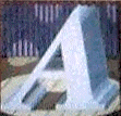
In addition to the checker mark discussed above,
early documentation came emblazoned with a stylized 'A'. This was a
3D variant of the standard Amiga logo font. Its multimedia
abilities were highlighted in this design through its placement
under a stage spotlight. The design was dropped soon after the
release of the A1000 with a greater emphasis on the
checkermark.
|
|
Amiga Watermark (1989 -
1993)
|
|
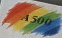
It is uncertain when the first watermark appeared.
The first recognizable image was on the cover of the A500 manual
where it cast a rainbow effect over the 'A500' name. The colours
create the impression that they are brush strokes on a canvas - a
distinct and immediately recognizable design, echoing back to Andy
Warhols' presence at the launch of the A1000 and the Amiga concept
of painting on-screen 'canvases'.

For the release of Workbench 2 in 1989 it was moved to a
prominent place on the manuals and disks. As you can see on the
image (right), the impression of a rainbow plays very strongly but
is not as impressive as the first design. It seems simpler and
removed the warm affect of the orange.

The image changed again with the release of Workbench 3,
returning to the paint metaphor. This emphasized the
immensely powerful AGA chipset with its capability of displaying
256,000 colours onscreen. At this point Deluxe Paint had become the
standard art package, resulting in many professionals associating
the Amiga with computer art.
The image takes on a darker mood with contrasting colours being
placed together. This is quite a sharp, distinct look that manages
to convey a sense of strength. The WB3 colour splash also appeared
on the AmigaOS 3.1 manuals but the disks reverted back to the
rainbow effect of WB2.0.
When Gateway bought the Amiga the disks and box were redesigned
again abandoning the colour splash and using a number of small
squares. This is probably the last time that the colour splash will
be used on the Amiga packaging rendering it an image of the
past.
|
TOP
Amiga Case design (1975 -
1995) |

Commodore 64C
|
Commodore Amiga 500
|
|
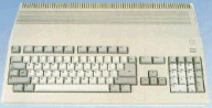
The Commodore heritage is not only evident in the
logo but the whole 'wedge' look of the Commodore Amiga systems. A
heritage that has been rejected by many current Amiga owners in
favour of placing their machines in a tower case. The design choice
was based upon a decision made in 1975 - ten years before the Amiga
was launched - by Jack Tramiel after making a loss of $5 million.
Learning from this error, he chose not to rely on outside suppliers
again, designing subsequent products in-house. (To read more about
this event go to the Commodore
History).
As shown by the associated images, the console all-in-one design
of low-end Amigas is a progression on the earlier Commodore 8-bit
design, even down to the gaps at the top of the system to allow air
to circulate. The general layout of the A500 keyboard has a similar
design, taking into account the space required for extra keys. The
keyboard also gains a more professional feel to it, making it more
useful for a home-office than the C64. The addition of a numeric
keypad, extra function keys, and drive lights attempt to provide
some additional functionality, providing real-world benefits rather
than the aesthetic features that Commodore viewed them.
When the A500 was launched the checkmark that had played such an
important part on the A1000 casing temporarily went missing. It
could be found on the packaging but was not present on the
Kickstart 1.x boot screen or the actual A500 casing. All that
graced the machine was the word 'Amiga' embedded into the top of
the casing, as well as the Commodore 'chickenhead' symbol and the
name of the machine (A500). This played a major part in Commodores'
plan to associate the Amiga with Commodore and all that they stood
for as well as marking a turning point in their attitude towards
Amiga. This time the Amiga was sold on its own merits rather than
the Commodore brand name.
However, whilst these designs were fine for earlier 8-bit models
it is a topic of debate whether the Amiga should have been graced
by their inclusion. In particular, the A1200 should have had a more
professional look using a pizza box design, a less-expandable
desktop case with an external keyboard. This had been moderately
successful with many of the Apple 68k machines and would have made
it more attractive to an office environment. This may have helped
to move the Amiga away from the game console image that it gained
during the late 1980's.
|
|
|
During 1991 and 1992 Commodore used surface mount technology
that reduced the hardware size further. This tactic produced the
A600 and A1200 - two low-end machines that offered new technology
in a familiar wedge-like case. In particular, the A600 design
removed the numeric keypad and shrank the keyboard to C64
proportions. The result was a severely cut down A500 that retailed
at exactly the same price.
The last Amiga computer to be launched - the A1200 - followed a
similar trend with a distinctive look. Fortunately, the
cream-coloured casing had been replaced in favour of a
white-professional looking design that improved on the rounded
edges of the A500. The moulded AMIGA logo also returned
into the case.
|
TOP
Commodore Digital Convergence
(1991 - 1992)
|
|
During the 1990's it finally dawned on Commodore that they
should begin to alter the basic design of the Amiga. Their solution
was the CDTV - a black unit inspired by the video player - that was
aimed at a market that would be known as the 'Digital Convergence'
market. The CDTV was designed to be a home entertainment unit
rather than a computer, blending with the stereo and the TV, hence
the black design. In their attempt to distinguish the machine from
the standard Amiga, Commodore insisted that it must be located a
few meters away from other desktops. While it looked the part, the
machine flopped as a result of its high price tag, disappointing
system specs and a misunderstanding market: Amiga owners did not
buy it as it was not sold as a computer and lacked Amiga
references; while ordinary customers did not buy it because it was
not a computer.
In retrospect the machine was ahead of its time, aiming towards
a market that would not solidify until the late 1990s. Audio
compact discs were just catching onto the market, it was not until
1994 that CD-ROM really took off in significant number. Its
low-processing capabilities also limited its ability to catch the
publics imagination.
|
TOP
Post-Commodore Logos (1996 -
Present) |
 Contender 1. The
Beehive Contender 1. The
Beehive
|
 Diametrics
logo Diametrics
logo
|
|
When Commodore went bust the Amiga trademark
disappeared and the checkmark became a thing of the past. The
Commodore-Amiga tag had been so successful in associating the
company with the system that most people thought the Amiga was
dead. This was a problem encountered by Escom when they
bought the Amiga - how to redefine the Amiga's position as a
computer looking to the future. The first stage of this process was
to separate the Commodore Amiga brand name into two distinct
businesses - Commodore BV for branded PCs, and Amiga Technologies
for the Amiga. This separated the Commodore and Amiga name, forcing
them to progress on completely different paths.
The second stage of the Amiga's rebirth was the need to develop a
new corporate image that was not linked to the past. Under the new
slogan 'Amiga- Back for the future', Amiga Technologies announced
the new Amiga logo - nicknamed the Beehive or Christmas tree design
by Amiga fans.
Contender 1. The Beehive
The Beehive logo was presented at the first Amiga Technologies GmbH
press conference. It was part of the design for several Amiga 4000
tower cases that were displayed.
A few months later an individual named Karl Jeacle found an
advert for Dianetics and commented on Usenet that their logo looked
exactly the same to the Amiga. Using the subtitle of 'The modern
science of mental health' it is hardly the image that a computer
that is trying to make its way back into the limelight should
portray.
|
 Winner. The wordmark Winner. The wordmark
|
Contender 2. The Red Square
As a result of the questionable design promoted by the beehive
design, Amiga Technologies issued a second wave of designs,
choosing an Amiga wordmark. In a press release FrogDesign stated
the new logo would create a positive response:
"The Amiga Wordmark evokes both a classic and
elegant feel as well as modern look. Bodoni, the font selected to
build upon is a classic font. Further refinements involving the
manipulation and subtraction of serifs and the addition of the red
square create a progressive, yet elegant logo. The red square
represents technology and adds energy to the logo by implying a
sense of motion.''
The new logo has a very European feel to it, and is partially
based upon the design principles of the Escom trademark. They both
share the same colour scheme but use them to create different
moods. The black text of the AMIGA creates a bold and strong
impression with the red square giving an interesting angle to the
work. Or it could be crap.
For better or worse, the wordmark logo has accompanied the Amiga
beyond the Escom era, becoming an important image during the
Gateway tenure and the current Amiga Inc. generation.
|
TOP
Boing Ball - the official Amiga
brand (1997 - Present)
|
 
|
After Escom went into liquidation the Amiga was
bought by Gateway who also wanted to add their own original slant
on the Amiga. After examining numerous images of the Amigas past
they settled on the use of the Boing Ball, from the first Amiga
demo. After 13 years, the Boing Ball became the official logo,
finally banishing the ghost of the Amiga checkmark. The Amiga
wordmark was incorporated into the design, symbolizing a rebirth of
the original Amiga ideals and a combination with the new. The
curved line below the Boing Ball creates a certain sense of motion
as well as creating an unconscious smile to the image (as shown by
the Mac logo, many feel that the smiling face invites non-computer
users to use the machine). As a contrast the original boing ball is
shown, taken from the AMosaic web browser, that shows how the image
has gained a modern edge through the adoption of light source and a
gradient on the red.
It almost seems as if the Amiga has come fall circle, recreating
the original ideas and feelings associated with the Amiga before
Commodore, Escom, and VisCorp. The Boing ball has changed from an
impressive demo to a representation of the whole Amiga
philosophy.
|
TOP
BACK
Last Update: 23/02/2002
|
|
|

|
Latest updates to the Amiga History Guide. (more)
|


Other interesting items in the archive!
|
|